
If you are still trying to land yourself on the digital map, the chances are that you will only survive for a while. You need a responsive web design in the contemporary digital and social revolution era, as users of all ages with access to various devices need to see you or your brand.
Why?
Brands and Organizations need to keep up with the pace of technological advancement. When the internet made its way to the digital realm, website accessibility was restricted to personal computers and laptops. However, as the magic of convenience charmed technology, mobiles, and smartphones entered the arena, and within no time, accessing the internet via mobile overtook desktop traffic by a huge margin.
With such an overwhelming change in the behavior of users, brands started to pay close attention to the responsiveness of their websites according to screen sizes and resolutions.
Please don’t make any wrong assumptions; the facts speak for themselves. Last year, the screen time view of websites was more on smartphones than on desktops or laptops, even though most viewers would want to read this article on a much larger screen.
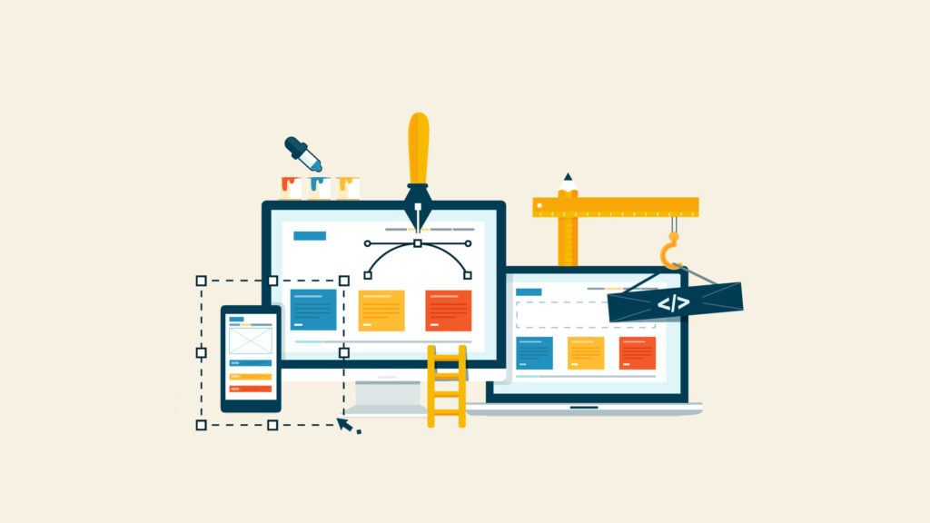
This blog post will discuss the four rudimentary principles of responsive web design. They are the standard foundation of rendering an unswerving user experience across all devices with screens of different sizes and an internet connection.
The 4 Components of Responsive Web Design

What is so important about it?
First of all, it is a web development process that generates robust changes to the theme of a website, contingent on the screen size and type of the device. It also helps in facilitating the website’s usability, user-friendly navigation, and accessible information.
Before diving into the components’ nitty-gritty, we need to get acquainted with the concept of UI and UX.
So what do we mean by UI and UX?
UI simply means the user interface – the point of user-computer interaction and communication with the device at hand. While UX means user experience, it means merely how a user feels when accessing the product or brand.
It’s really that simple.
First Principle: Fluid Grids and Layouts
Now let’s jump to the first and foremost key principle in responsive design: the fluid grids and layouts. When website projects hit the limelight, designers were accustomed to the traditional pixel measurement criteria, as opposed to fluid grids, which allow elements and objects to resize proportionally and in accordance with the layout of the screen.
In other words, adapting to different screen sizes without making many significant changes to the CSS code. The function of adaptability ensures the readability of the content, and all the images and graphics remain attractive no matter what device you are viewing the website on.
Rather than toying with unit percentages for pixel values, the designers find it easier by embracing the robustness of fluid grids, where they can expand the scalability and flexibility and reduce the need for separate designs for each device. It allows the designers to create different web pages that adapt to the current viewport width and height.
As per conventional norms, the max-width property is used instead of giving a fixed width to an element, image, or any media object. Also, using percentage, viewport height, or viewport width improves adaptability that is not conceivable with a pixel-related approach.
So, next time you design a layout, familiarize yourself with these small changes and start benefitting from responsive design techniques. It is also important to design the grid of the website and then start developing web copy and related images.
Second Principle: Flexible Images and Media
There was a time when the audience required comprehensive information regarding the company, and it was a hassle for the designer to box down all the details. But then again, new challenges made their way to the arena. Issues related to font compatibility and typography became a nightmare. However, with time, designers learned that too much textual content led to information clutter, and then came the era of white space and infographics.
The designer’s aptitude for images, graphics, and video media is challenged. Furthermore, optimizing the webpage or the load time comes into play when large images or video clips are an essential part of the design. In this situation, creating a responsive web design may negatively impact the user experience, especially related to smartphones. Designers employ techniques like CSS media queries and responsive image tags to address this concern.
Why?
CSS media queries allow for conditional loading of CSS styles based on screen size, while responsive image tags adapt the image resolution and size based on the available space.
Third Principle: Media Queries
Media queries play an elemental role, allowing developers to apply diverse CSS styles based on several factors, such as screen width, orientation, and resolution. They can help in bringing a fully responsive website to life.
How?
Designers can tailor the layout, typography, and other visual elements by outlining specific breakpoints to suit different devices, such as laptops, tabs, and even smartphones with different screen sizes.
Ultimately, the third principle enables a seamless transition between desktop, tablet, and mobile views, ensuring the website looks and functions without impacting the user experience across diverse screen sizes.
Fourth Principle: Mobile-First Approach
The mobile-first approach is a philosophy that prioritizes web designing for mobile devices first and then progressively enhances the experience for larger screens. It implies that instead of writing CSS for large screens and then applying media queries to shrink the design for smaller screens, you can write CSS for smartphones and tabs and then use media queries to expand the design for larger screens. This approach emphasizes minimalism, focusing on the most critical content and interactions.
The Crux
The facet of digital technology is constantly evolving, and the importance of responsive web design is becoming an essential requirement without stating it separately. As you gradually adopt the 4 principles mentioned above, you can create websites that acclimatize seamlessly to different devices and deliver a dependable and wonderful user experience.
Remember, a fully responsive website helps businesses rank higher in search engine results and ensures seamless traffic with enhanced user experience. Always audit and optimize your website to stay ahead of the competition, increase the lead-to-conversion ratio, and build a formidable online presence.
And If you still need help designing a fully responsive website, contact Dallas SEO Pros.